
By: Andrew B. Noto, Investment Advisor Representative
As an advisor, it is sometimes a difficult to explain to a client why their assets are not keeping up with the popular, broad-based market indices such as the S&P 500 or the Dow Jones Industrial Average. The correct answer most of the time is because the comparison being made is inappropriate. The S&P 500 is an all equity (stock) index and their portfolio usually contains a mix of equity and fixed income (bond or interest bearing) positions. The comparison being made is the epitome of the old saying “it’s like comparing apples and oranges”.
The next question that usually follows is why do I have fixed income in my portfolio? Believe it or not, that question has some validity to it due to the market conditions over the last decade or so. Since the Great Recession in 2008-2009 when the Federal Reserve began their policy of quantitative easing, fixed income interest rates have been nominal at best. In fact, for the eleven years from January 1st, 2009 to December 31st, 2019, the total return of the S&P 500, both growth and dividends included, increased by 351% while the Bloomberg Barclays US Aggregate Bond Index increased a paltry 53% over the same period of time. During that time, stocks returned 14.67% annually while bonds only returned 3.94% annually.
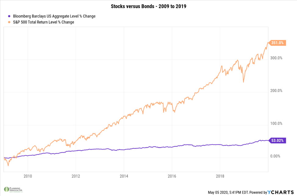
Since the beginning of the Great Recession over a decade ago, a sense of fear has slowly escaped many investors’ minds as the reward of owning equities has far exceed the risk associated with them. For example, the S&P 500 Total Return only experienced one negative year from 2009 to 2019 and that was in 2018 when we saw the S&P 500 decline 19.78% from its highs on Christmas Eve that year, a mere 0.22% from entering bear market territory. In this case we are referring to the S&P 500 Total Return because it considers both the gains of the companies in the index as well as the dividends that those companies pay.
With the total return of the S&P 500 only producing one negative year since 2009, and even that year investors only saw a decline of 4.38%, why not just own a fund that tracks the S&P 500? With recent history, that is not totally flawed thinking, but the first four months of 2020 has reminded us why investing is not that easy. After climbing to its all-time high of 3,386 points on February 19th, the S&P 500 tumbled 1,149 points, or 34%, in just 23 trading days. Since that day, March 23rd to be exact, the index has rebounded by regaining 675 of the points by the end of April and currently sits just 14% off its all-time highs as of the close on May 6th.
So far, if the irrational market conditions in 2020 have taught us anything, it is the importance of diversification and asset allocation. There are two types of market risk, systematic risk and unsystematic risk. What we have seen this year thus far is a perfect example of systematic risk. Systematic risk is the risk inherent to the entire market which is both unpredictable and impossible to completely avoid. (1) Recent examples of this type of risk include the 9/11 terrorist attacks, natural disasters like Hurricane Katrina and most recently, a global pandemic like COVID-19. Since this type of risk is impossible to completely avoid, its affects can only be mitigated. One of the ways it can be mitigated is with proper asset allocation and with proper asset allocation comes diversification among asset classes.
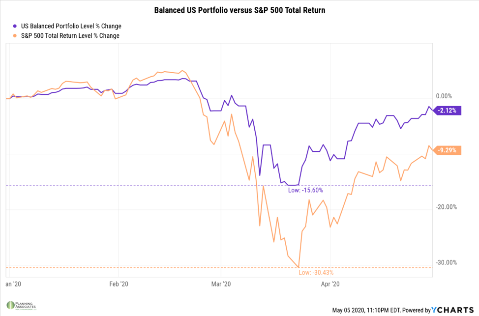
The first four months is a reminder why portfolios are not meant to keep up with an index like the S&P 500 or Dow Jones Industrial Average. The total return of the S&P 500 was down over 30% year to date on March 23rd while a balanced US portfolio made up of 50% Vanguard Total Market ETF (VTI) and 50% Vanguard Total Bond Market ETF (BND) only experienced a decline of 15% during that same time. Sure, over time the total return of the S&P 500 will outperform a balanced portfolio, but that would not be absent of several “gut checks” along the way. Those “gut checks” include a 52% decline in March of 2009 during the Great Recession or a 40% decline in October of 2002 during the Dot Com Bubble. In fact, the balanced portfolio illustrated above would have outperformed the total return of the S&P 500 twice since 2009 and would have under-performed the index by less than 3% two other years. But here I am, comparing apples to oranges.
So, when looking at the performance of your portfolio, consider the overall objective of your funds before making any comparisons to an index or your friend at the gym. A systematic market event like we have experienced thus far this year with the coronavirus is a great opportunity to evaluate your risk tolerance to determine whether you are taking on too much risk or not taking on enough risk. If you think that you want the returns of the S&P 500, look at the recent movements in the market to see how your portfolio may have been affected. Here is a simple exercise for you. Start by multiplying your investable assets by 69.57%. The result of that calculation would have been the value of your portfolio at the end of the day on March 23rd this year not considering any withdrawals or additions to the portfolio. Consider how that number makes you feel. Then, if you wanted your portfolio to get back to its value from the first day of the year, think about what type of performance it would have to achieve to do so. To do the math for you, it would have to increase 43.74%, once again not factoring for any withdrawals or additions, to return to its beginning of the year value.
Additionally, your risk tolerance should take into consideration your willingness to accept risk as well as your ability to accept it. It is our job to discuss with you your goals and expectations while matching those to a proper risk tolerance. Whether you think you are taking too much risk, not enough risk, or simply are not sure what your risk tolerance truly is, please set up a time to speak with us. Now is a perfect time to talk about asset allocation and diversification as its benefits are on full display in the market right now.
1 Investopedia.com – Systematic Risk
All charts used are created with YCharts.
This commentary reflects the personal opinions, viewpoints and analyses of Planning Associates Wealth Management, LLC employees providing such comments, and should not be regarded as a description of advisory services provided by Planning Associates Wealth Management, LLC or performance returns of any Planning Associates Wealth Management, LLC client. The views reflected in the commentary are subject to change at any time without notice. Nothing in this commentary constitutes investment advice, performance data or any recommendation that any particular security, portfolio of securities, transaction or investment strategy is suitable for any specific person. Any mention of a particular security and related performance data is not a recommendation to buy or sell that security. Planning Associates Wealth Management, LLC manages its clients’ accounts using a variety of investment techniques and strategies, which are not necessarily discussed in the commentary. Investments in securities involve the risk of loss. Past performance is no guarantee of future results.